ShopDreamUp AI ArtDreamUp
Deviation Actions


Suggested Deviants


Suggested Collections


You Might Like…


Featured in Groups


Description
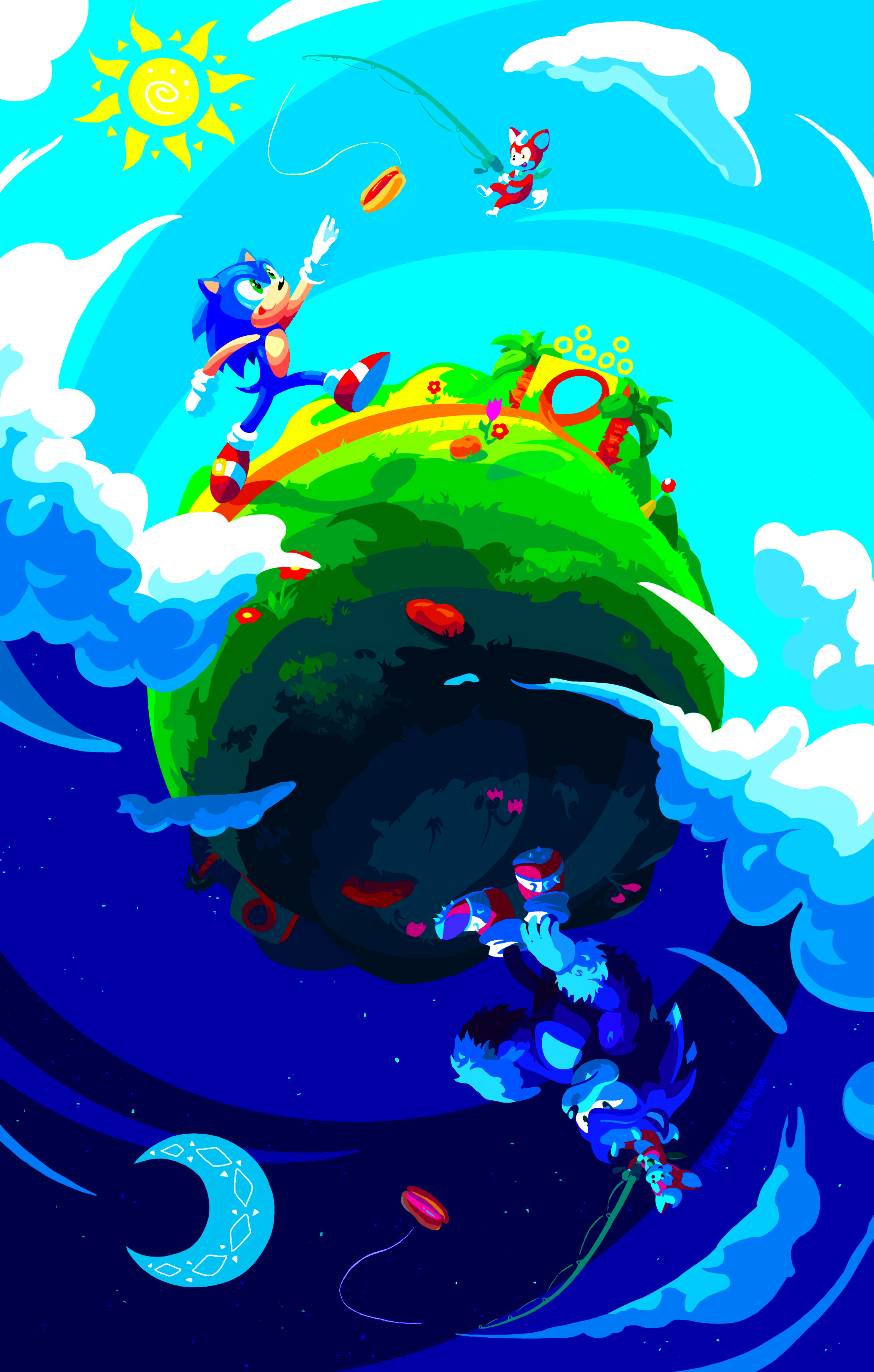
...he'll be chasing that chili dog  Worked together with ~EllyTheGee
 to make this.
She came up with the idea and sketch, and I colored~
...This. Is prolly the most challenging collab of the bunch because of the day/night thing. Since I only work with flat colors, I couldn't make the sky transition from day to sunset to night, which is what I initially wanted to do (I did try... it looked way too complicated, stripey, and distracting). I felt like an idiot once it dawned on me that I could make clouds be the transition Also the composition was quite a challenge, I wasn't sure how to approach the eye flow. I settled on an "s" shaped composition, uh, if that even exists Hopefully it curves your eye down the image.
"Sonic" and all other trademarks and trade names are properties of .
.
 Click for desktop wallpaper version~
or click here to see an upside-down version to better see the werehog half~
to make this. She came up with the idea and sketch, and I colored~
...This. Is prolly the most challenging collab of the bunch because of the day/night thing. Since I only work with flat colors, I couldn't make the sky transition from day to sunset to night, which is what I initially wanted to do (I did try... it looked way too complicated, stripey, and distracting). I felt like an idiot once it dawned on me that I could make clouds be the transition
"Sonic" and all other trademarks and trade names are properties of
.or click here to see an upside-down version to better see the werehog half~
Image size
2292x3600px 1.04 MB
© 2012 - 2024 rontufox
Comments114
Join the community to add your comment. Already a deviant? Log In
I told myself that I can't do any critiques at the moment but one look at this piece and I couldn't resist. There's just so many elements that draw you in when you look at it. It's definitely worth a closer look.
---
LINEART: This piece employs a lineart-free style, which fits extremely well with the piece. From someone who has been asked to do lineart-free work before, it can be extremely difficult to get right and even frustrating. But it's handled beautifully here! Very clean work.
COLORING/SHADING: The coloring and shading also add to the lineart-free style, creating a wonderful layer of depth that substitutes any need for foreshortening. The coloring also plays off an emotional aspect (see CHARACTERS/ANATOMY section) with success. Excellent clean-cut coloring/shading separation and an excellent range of values on the color palette.
COMPOSITION: The composition in this is incredible! About half of a piece's overall presentation is in the composition and this has been pulled off beautifully with a well-balanced placement of characters and even though the globe is set dead center of the canvas, the monotony isn't present due to the excellent placements of clouds, which provide an excellent offset horizontal line as well as a barrier between the sky gradients as well as adding interest and expansion by breaking off the canvas borders. Very excellent move. The piece is slightly off-balance since the sun and moon are on the same side but this isn't a major detraction.
CHARACTERS/ANATOMY: Characters show very nice posing and placement and play off contrasting emotions in the face and body expression that fit well with the color gradients. We've got an happy, excited, feel on the upper part of the canvas while we have not a depressed, but a more tired feel on the lower half. Overall anatomy fits well with what is considered "Sonic style" while still employing some unique elements. I will admit that the werehog's shadowed hand is a bit odd-looking. I understand what the desired effect is but it appears to be a bunch of fur with no distinguished hand. But that might just be me being picky too!
BACKGROUND: Background is a simple gradient but it is pulled off magnificently when combined with the elements of the other sections.
OTHER ELEMENTS: There's actually an interesting employment of texture in this piece, particularly in the sun and moon element. It adds an interesting dimension to the piece and doesn't glare. An interesting and successful move.
IN COMPARISON OF OTHERS WORKS BY THE ARTIST: The artist has a wide range of medium use in their gallery and this work in definitely on par with pieces that employ similar coloring techniques.
POSSIBLE MEANS OF IMPROVEMENT: Really, the only thing that glares out a little is the similarity in some of the shading tones with the background gradients. This causes some of the character elements (such as Sonic's outstretched hand) to become lost in the background. Possibly better balance in the composition as mentioned but that would take some experimenting.
OVERALL IMPACT: This is one of the most interesting pieces of art I've seen in relation to this game. Combined with the artist's style and the incredible composition, an excellent piece! Well done indeed!